108|Contemporary is a non-profit community arts organization that supports Oklahoma’s contemporary fine craft artists by connecting them with audiences and opportunities through education, recognition, and exhibition programming. Craft is prominent in Oklahoma, and 108 strives to educated and develop unique connections with the community by drawing attention to contemporary pieces found in our home state and from around the world. Located in downtown Tulsa's Art District.
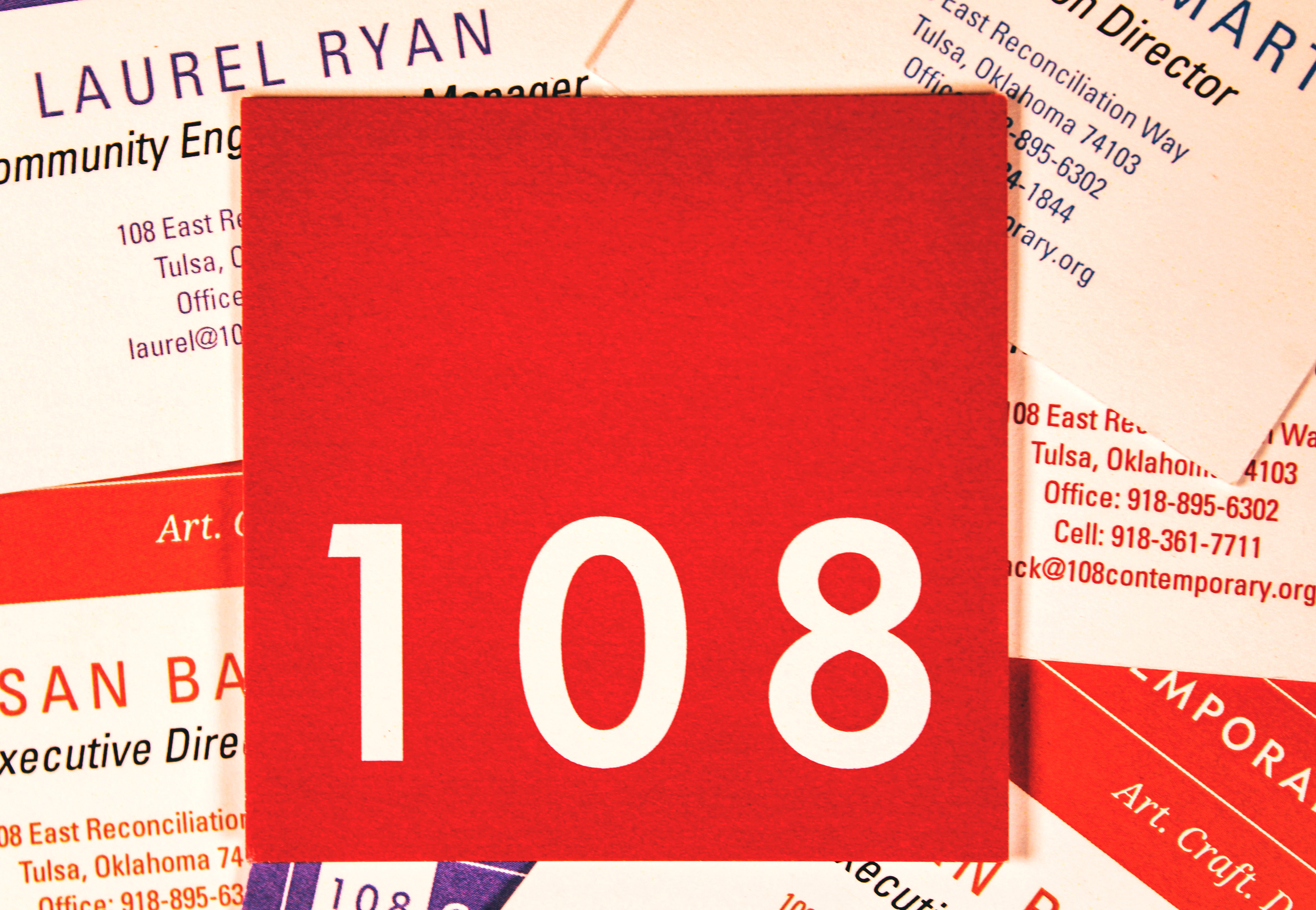
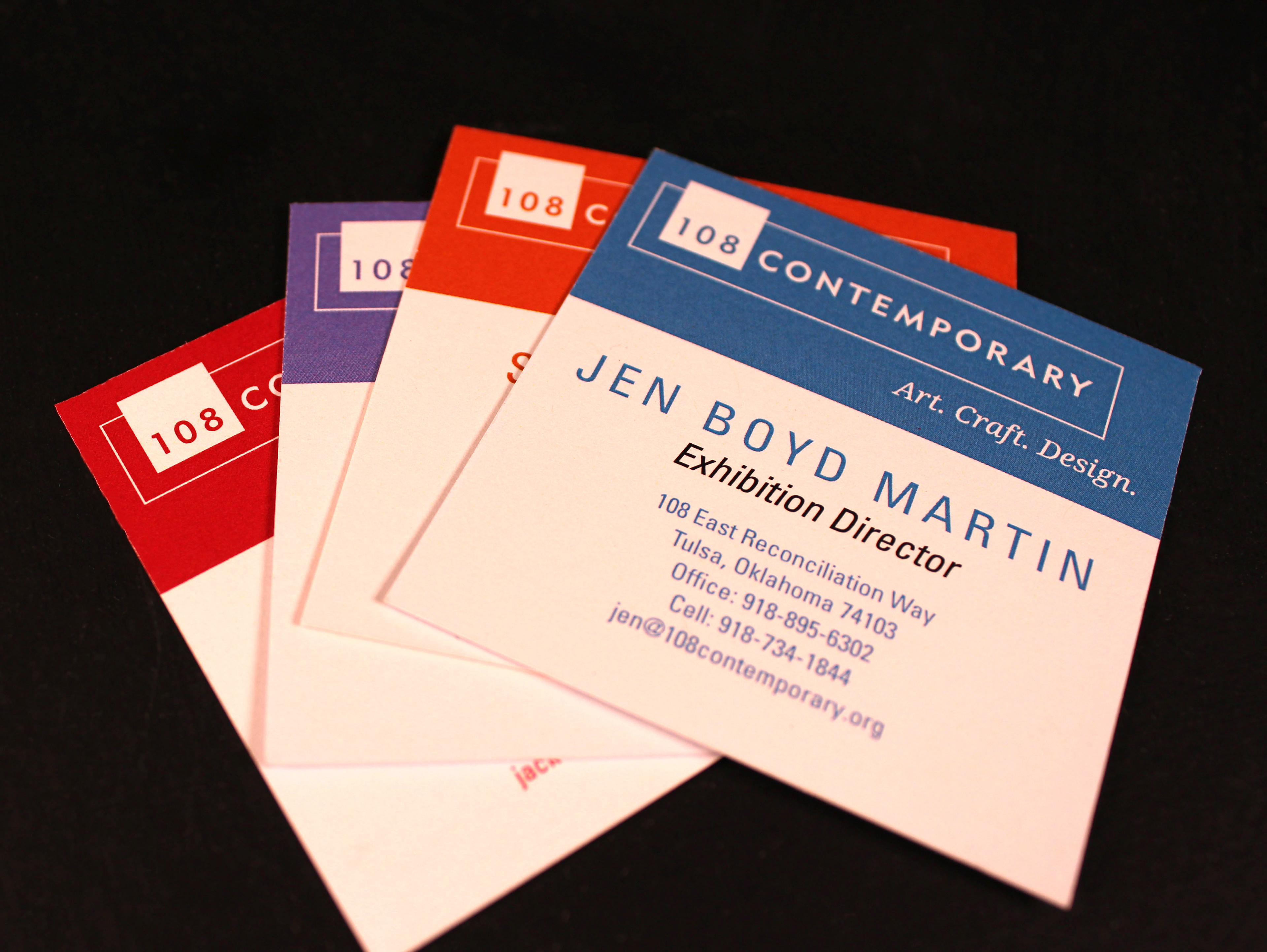
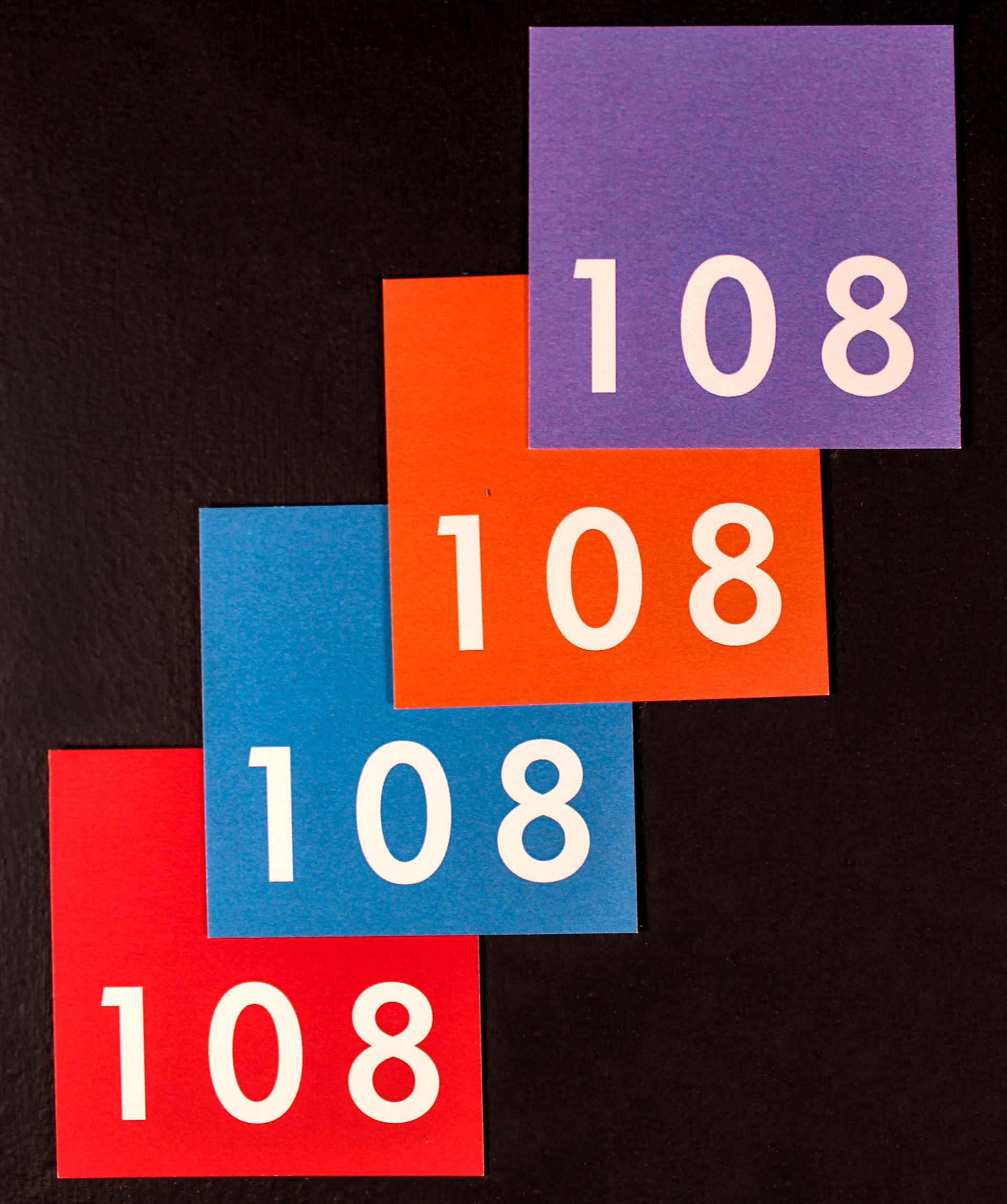
Business card redesign that utilizes the square shape of their trademark. The business card also utilizes their flexible branding system; by giving each staff member their own color they are able to more easily distinguish their own cards.
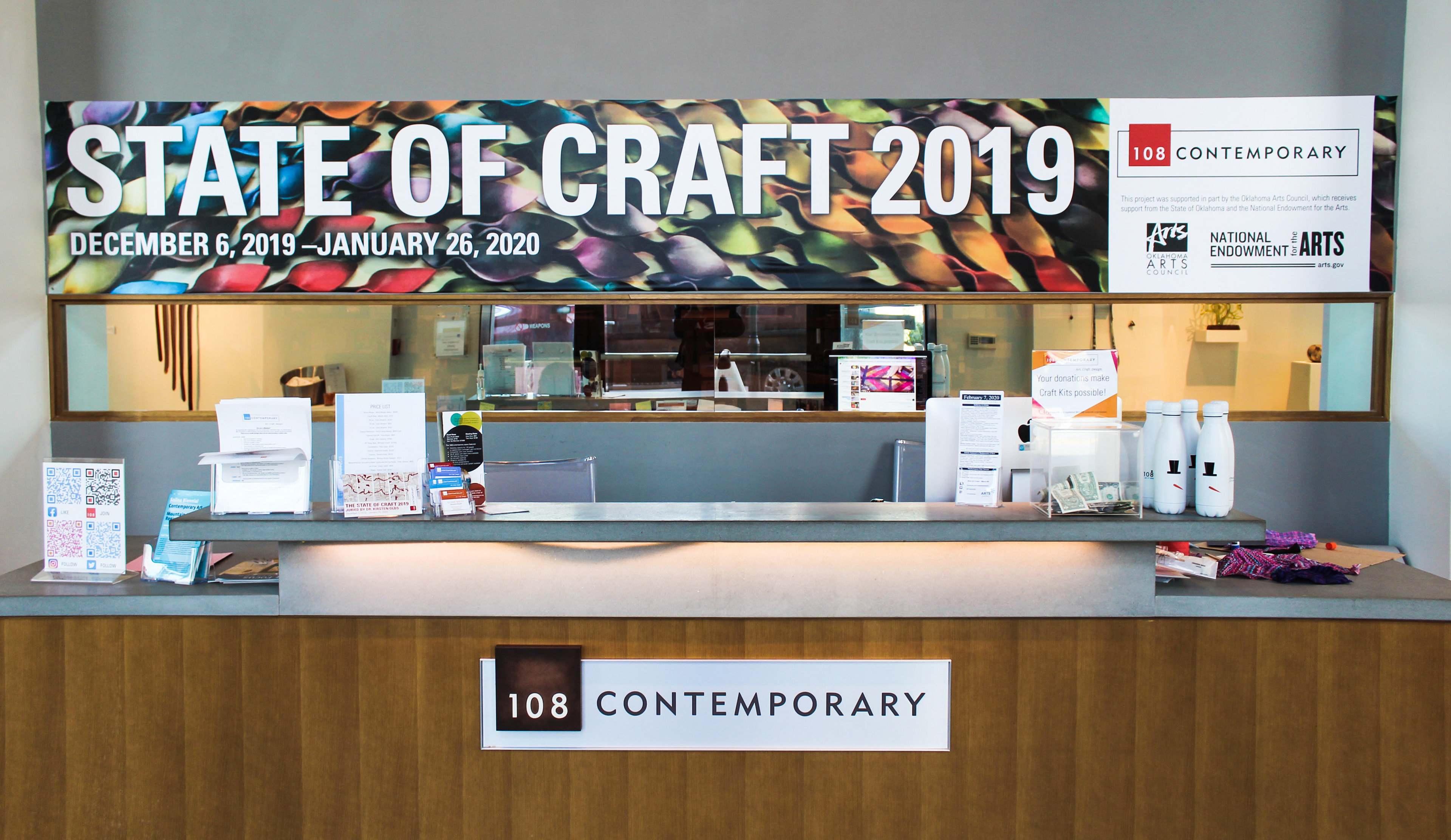
Vinyl above Desk
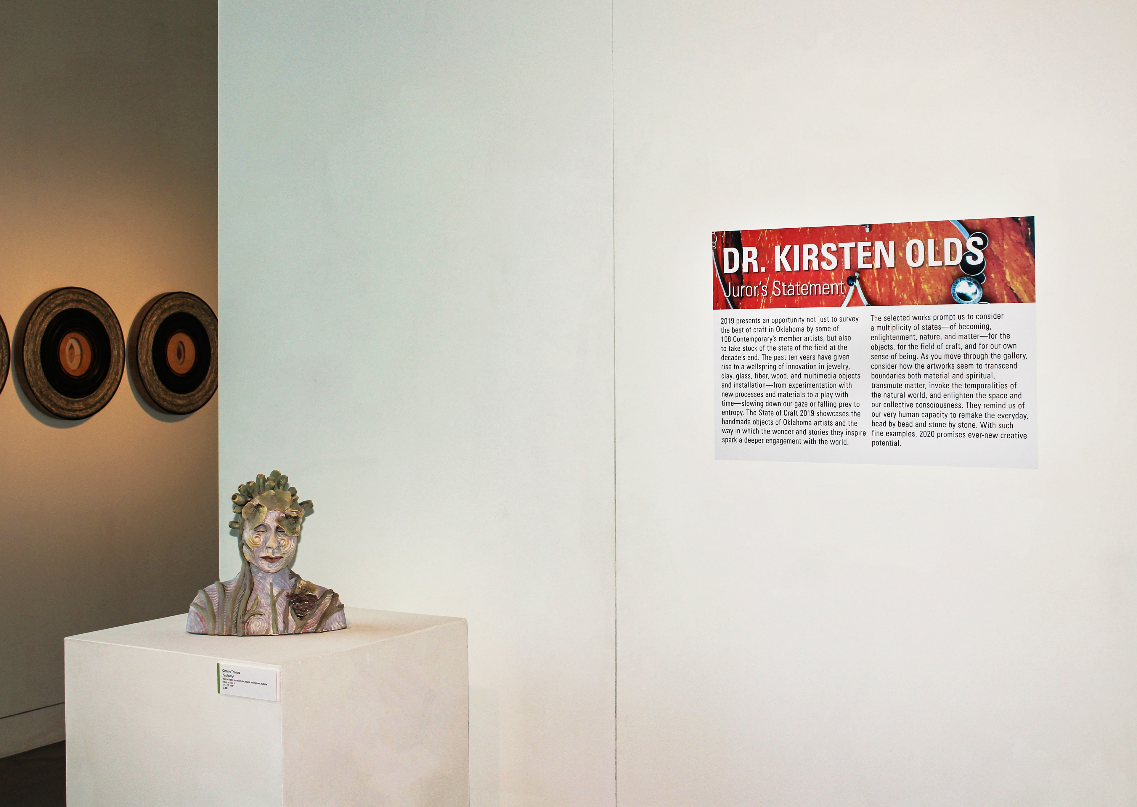
Juror's Statement
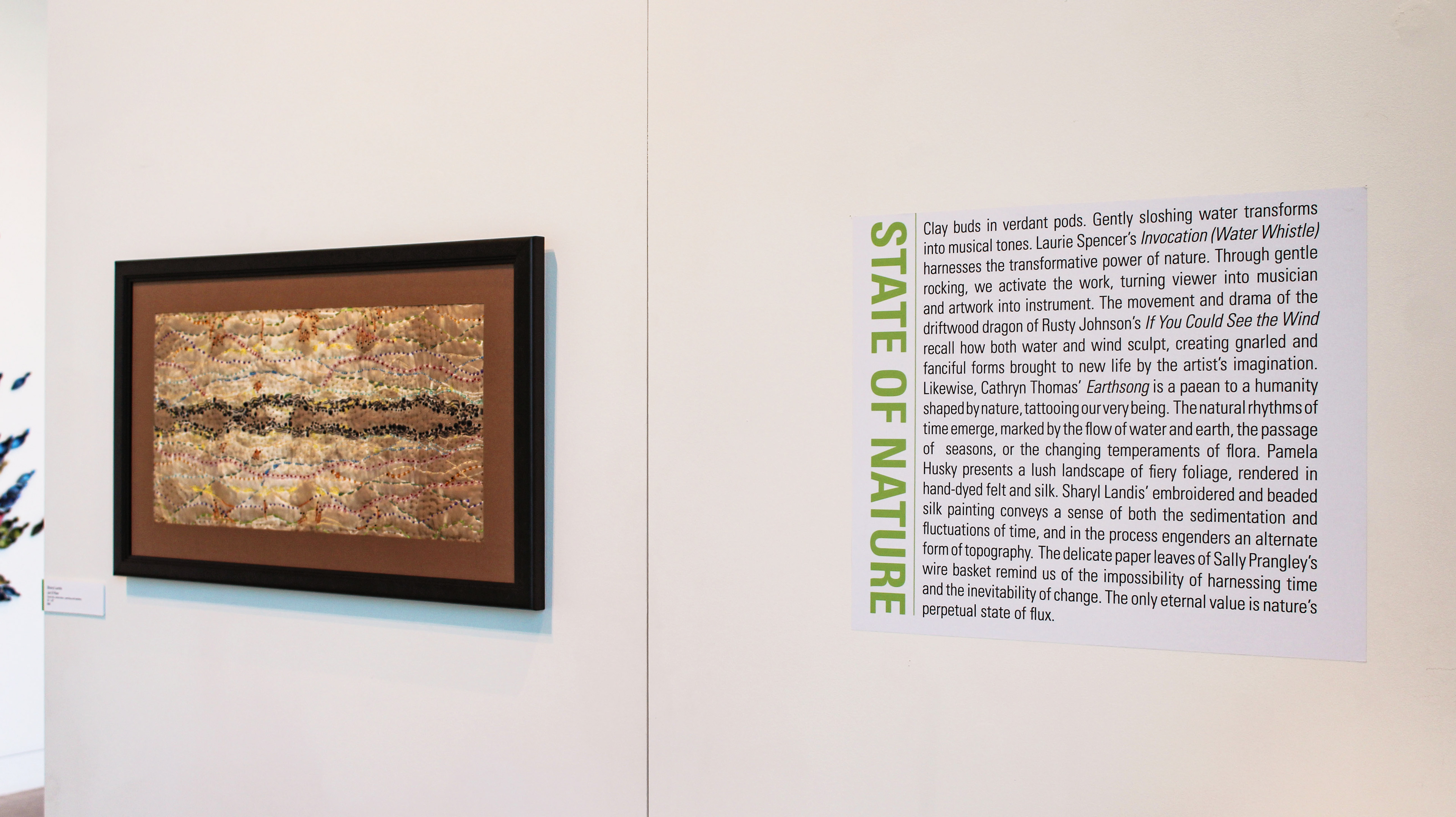
Example of how the category description was linked to the work through the color of the title to the color detail on the pieces' labels.

Category Descriptions
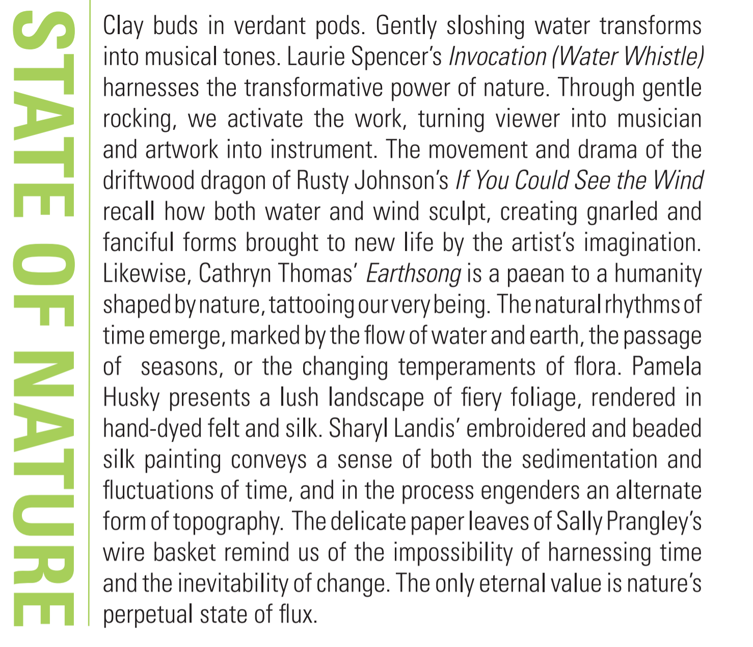
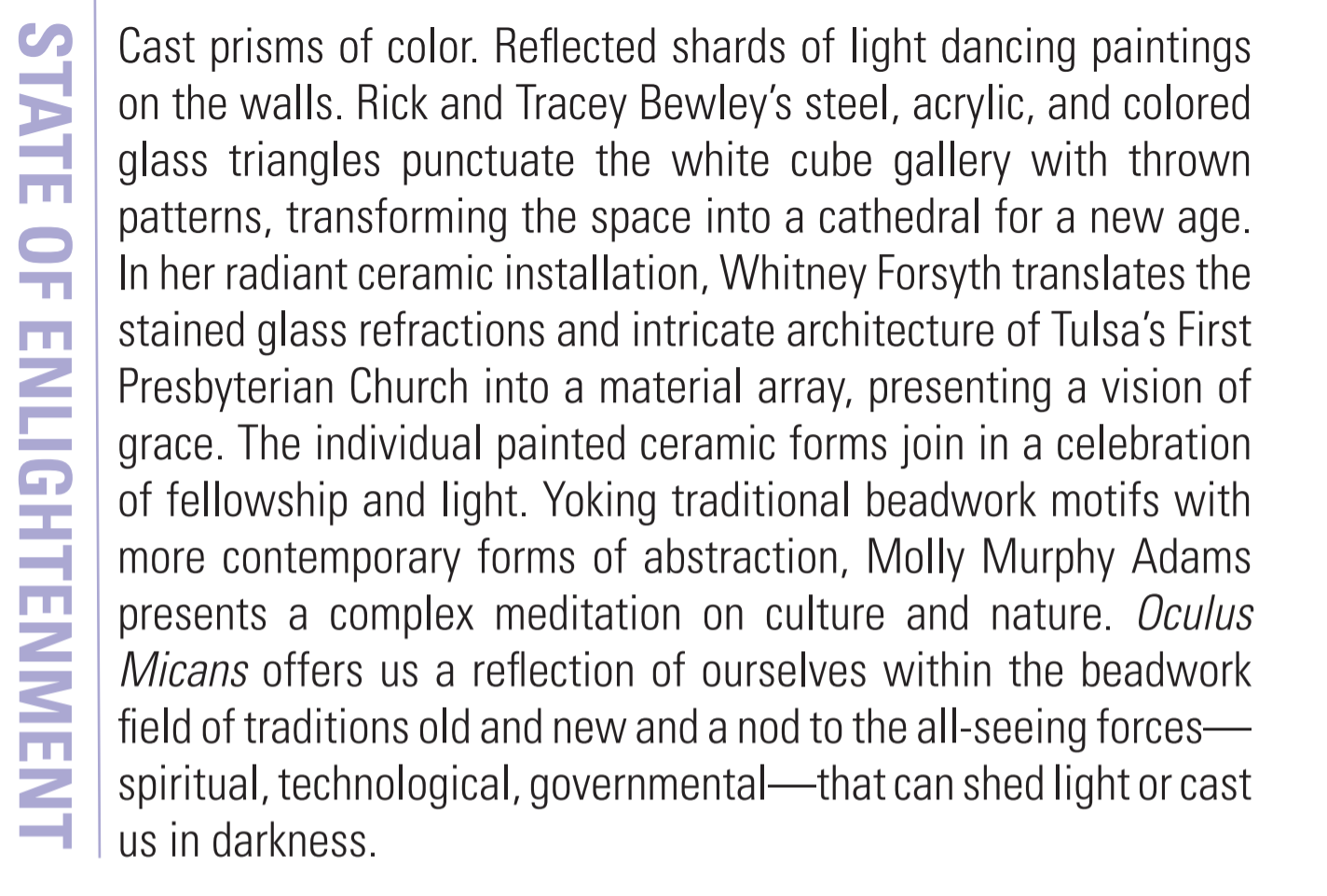
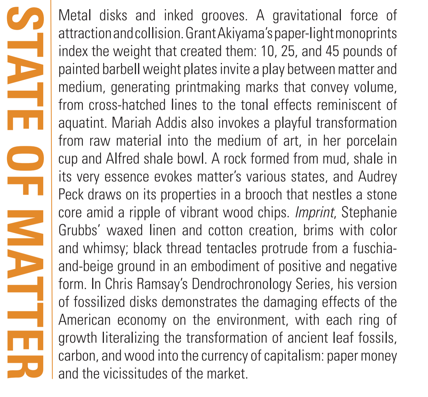
State of Craft 2019 was Juried by Dr. Kristen Olds and included various Oklahoman artists. For this exhibition it was important that the exquisite detail in the artworks was showcased. To do this I pulled the textures of the artists work into my vinyl designs, as well as any promotional material. This exhibition was also divided into thematic categories. By working with both Dr. Olds and the Exhibition Director, Jen Boyd Martin we developed a color system that was used to connect each art work to it's category description. The color system allowed guests to draw connections between the works and get a deeper understanding of why the Juror included the piece.
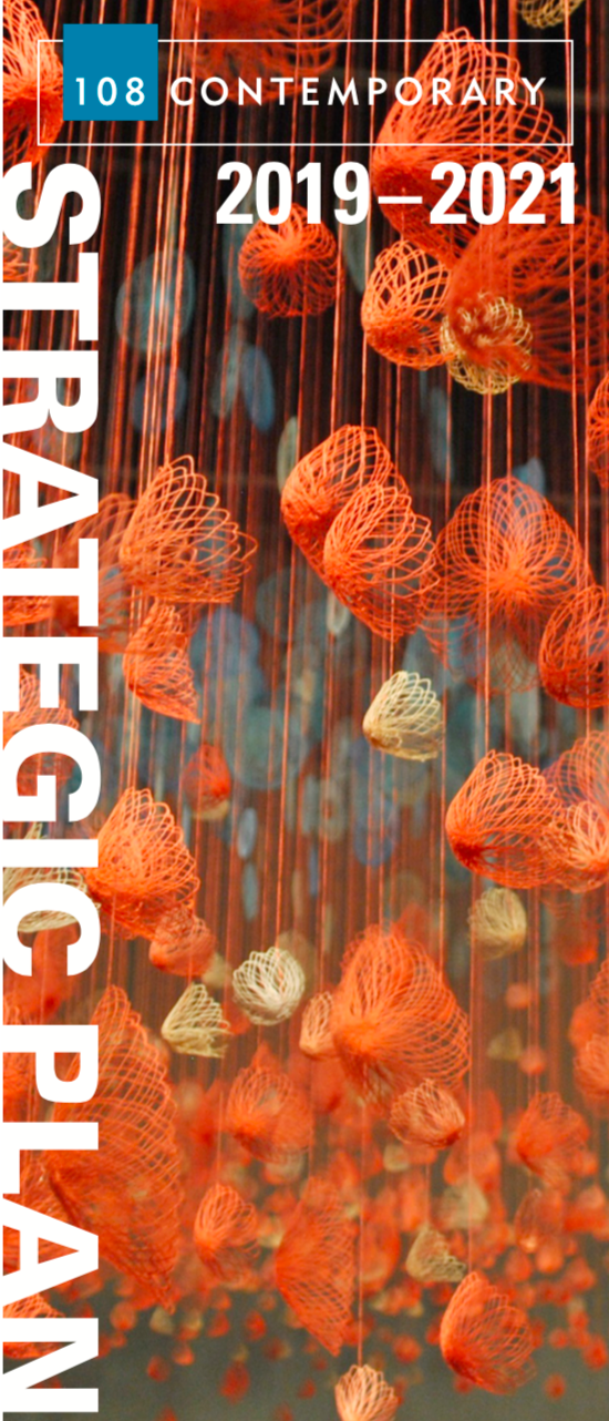
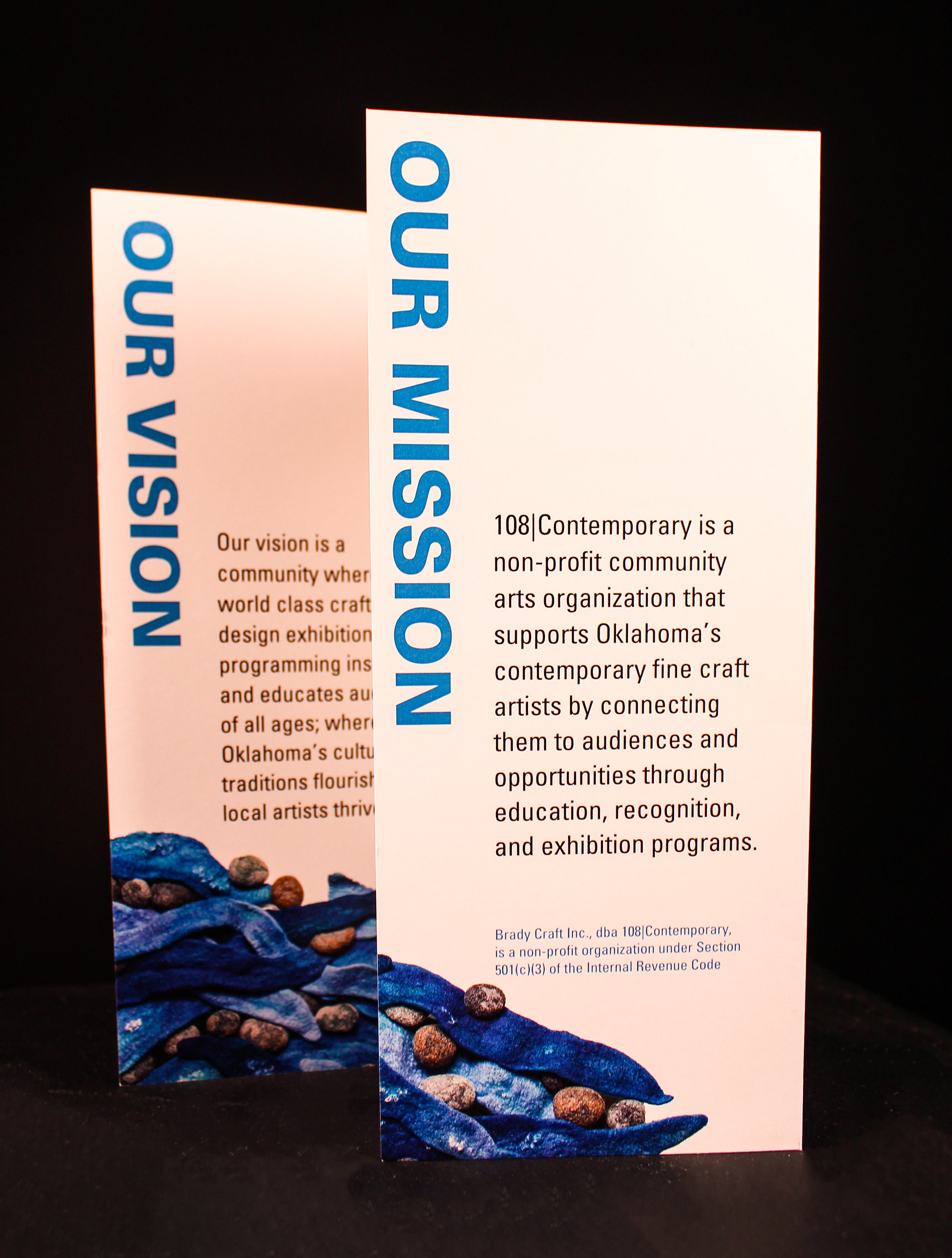

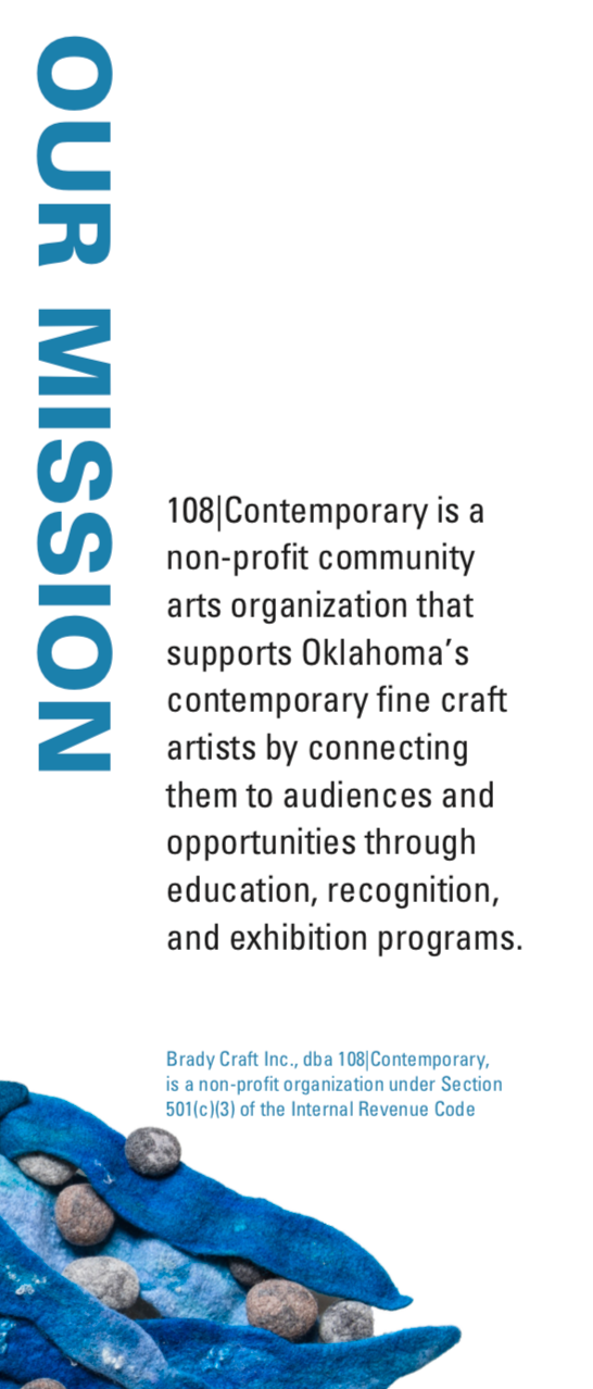

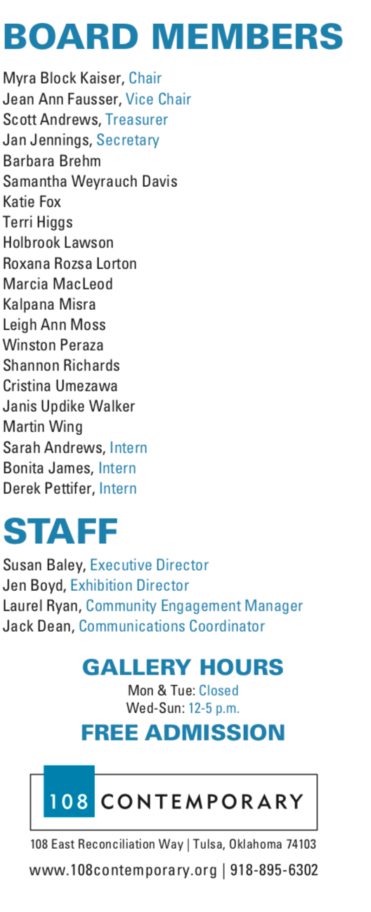
A trifold, that breaks down the goals of 108| Contemporary Gallery for 2019- 2021. Inspiration came directly from work that had be previously shown at 108| Gallery. It was important to create a trifold that flowed page to page to insure clarity. The use of orange and blue throughout the brochure was used to create a calm but motivating atmosphere, as this will be referenced in many board meetings.
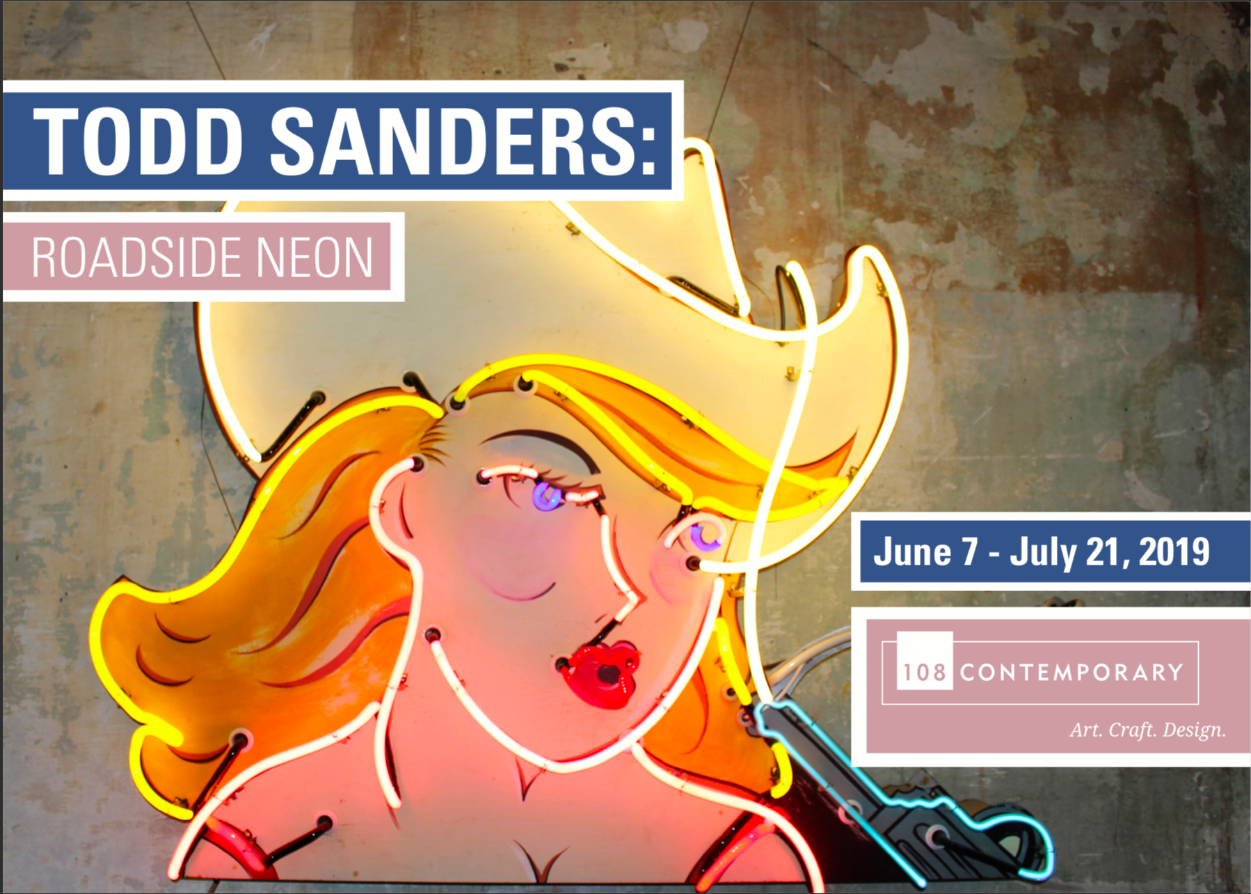

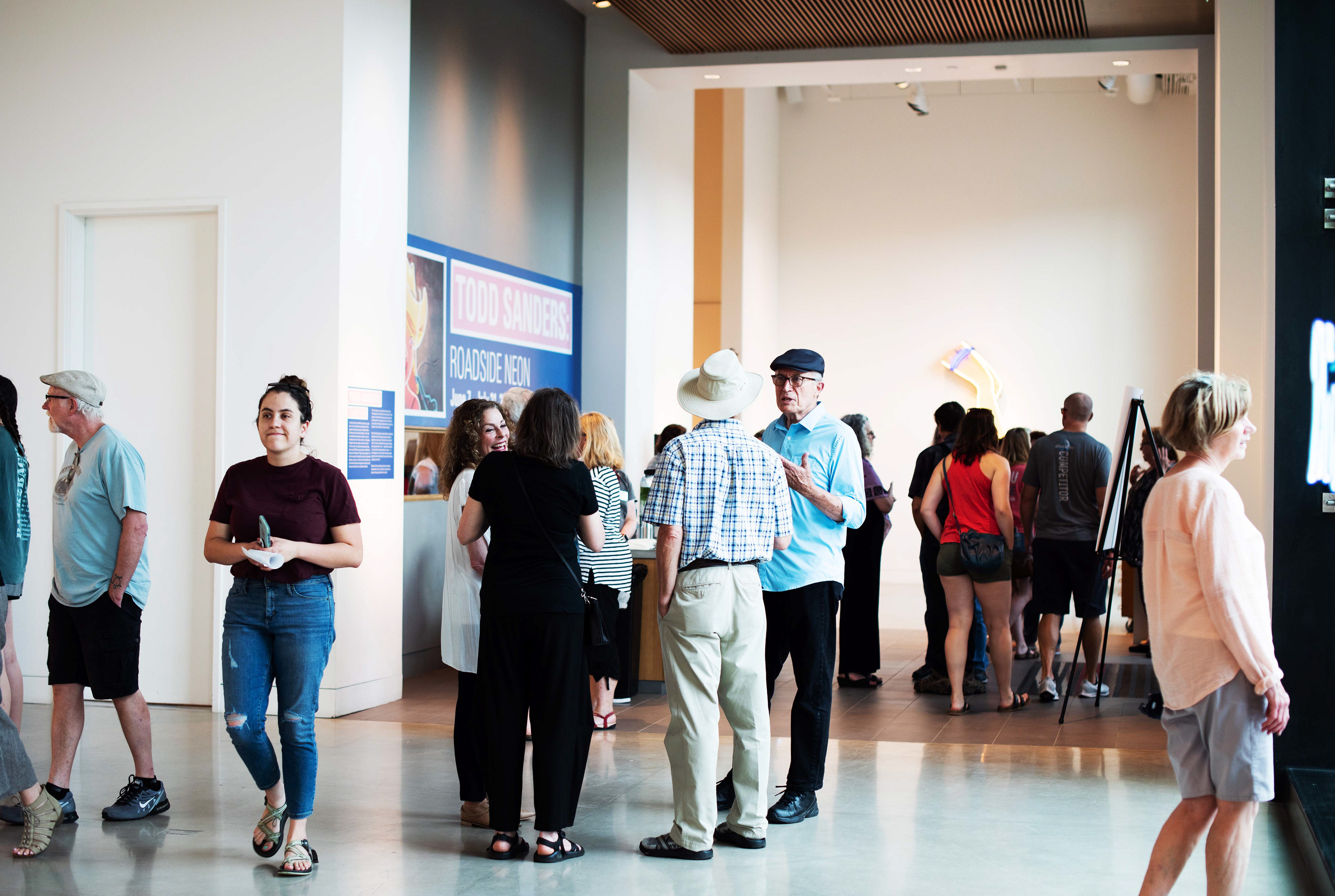
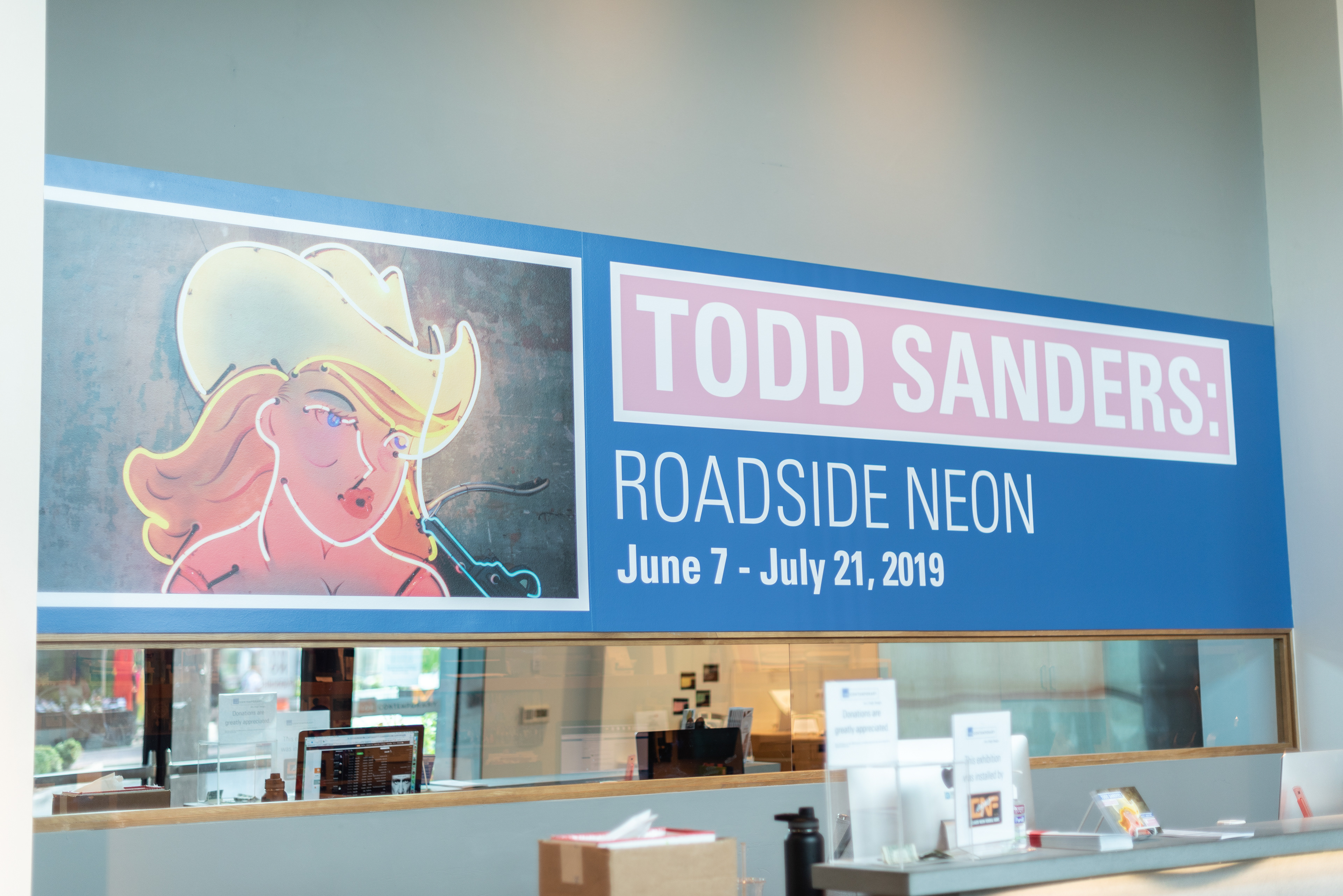
Environmental vinyl and mail media promoting Todd Sanders' Roadside Neon show which ran from June 7 - July 21, 2019. Todd Sanders creates work that celebrates the neon artwork one may find while driving down Route 66. For this energetic showcase it was important to create media that matched its energy without overpowering the art pieces. To do this I pulled the pink and blues from the work and muted them enough that they felt natural with the work, yet did not compete against it.
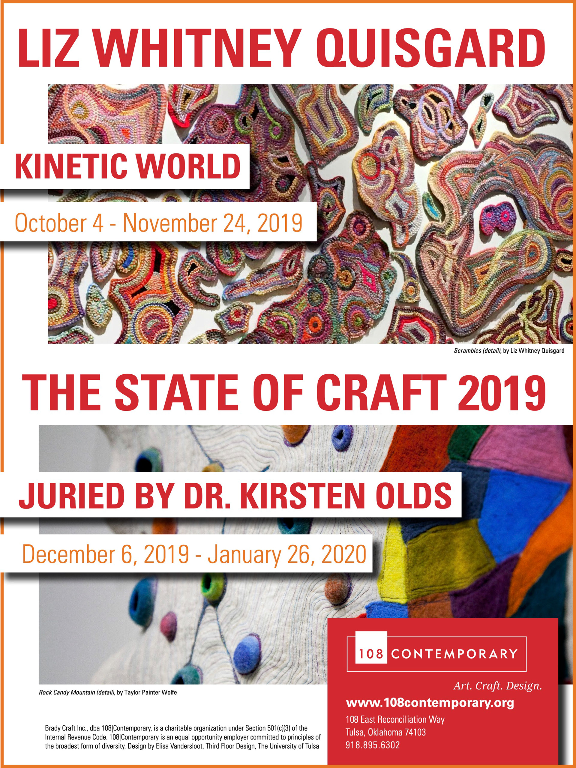
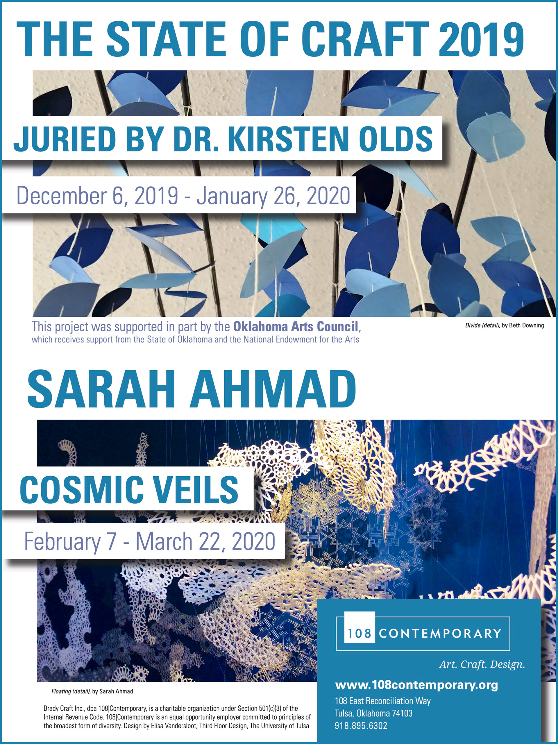
One page advertisements published in Art Focus Oklahoma for Fall and Winter events.
