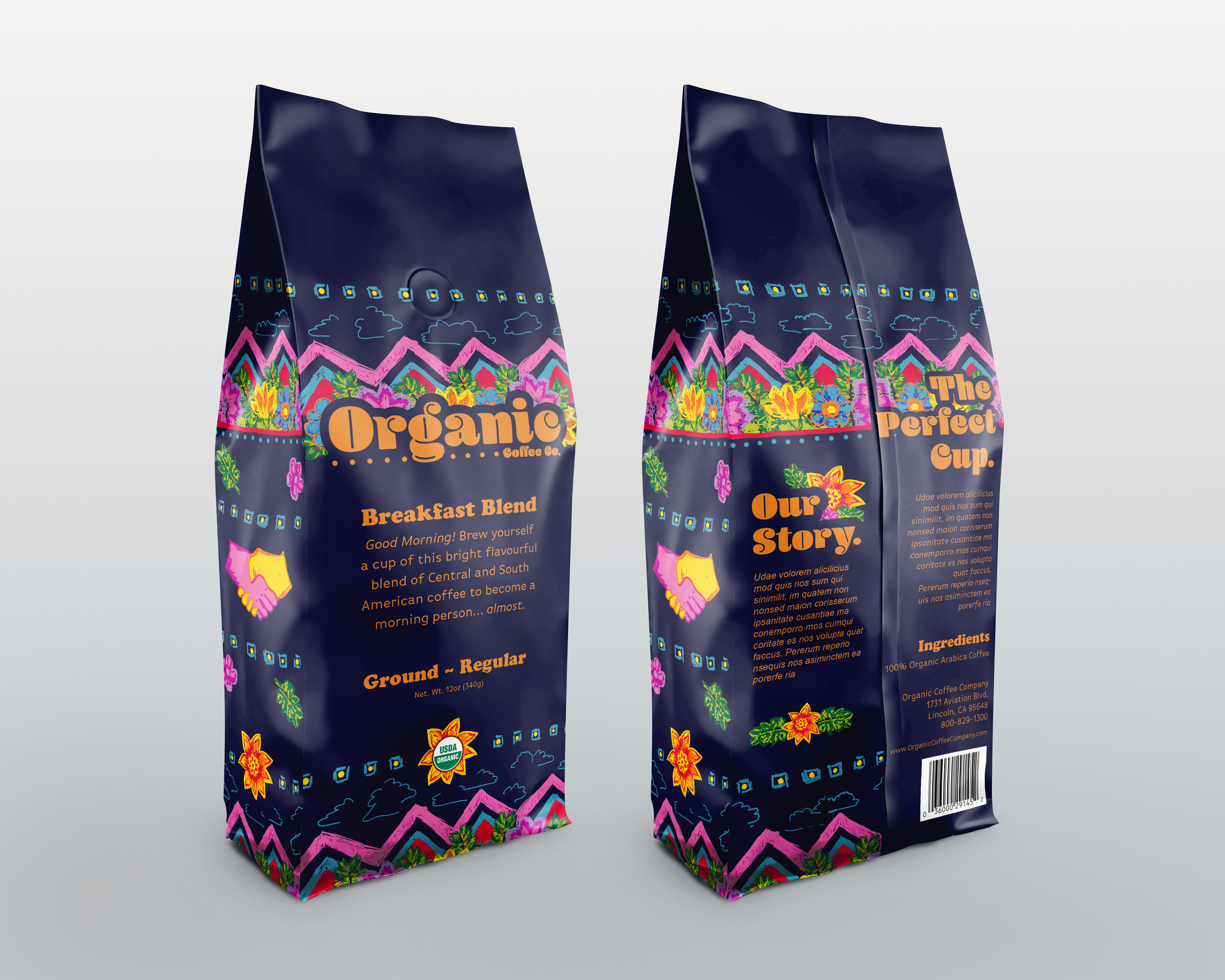
In this class assignment, we worked with David Clark; principle creative director of Station8 Branding in Tulsa. We were each tasked to re-design a new package for Organic Coffee Co. For this design I took inspiration from where the coffee beans are sourced, and created my illustrations based on colorful Guatemalan textiles. The bright colors give the package shelf presence where mostly, reds, yellows, and browns are present. I also, used the symbol of the shaking hands to represent their commitment to fair trade and providing the communities where they source their beans with resources that improve quality of life.